
We’ve been having a rather fine summer this year – day after day of hot and sunny eventually followed by a couple of downpours just when it was getting too much. I’d much rather have a bit of a heatwave than a repetition of last year’s deluge. So I thought it’d be interesting to compile the last year and a half’s solar photovoltaic generation figures into a graph and see how we were doing after last year’s lack of sunshine and further loss of generation when I didn’t notice one of the inverters was bust. (Click on the graph for full size.)
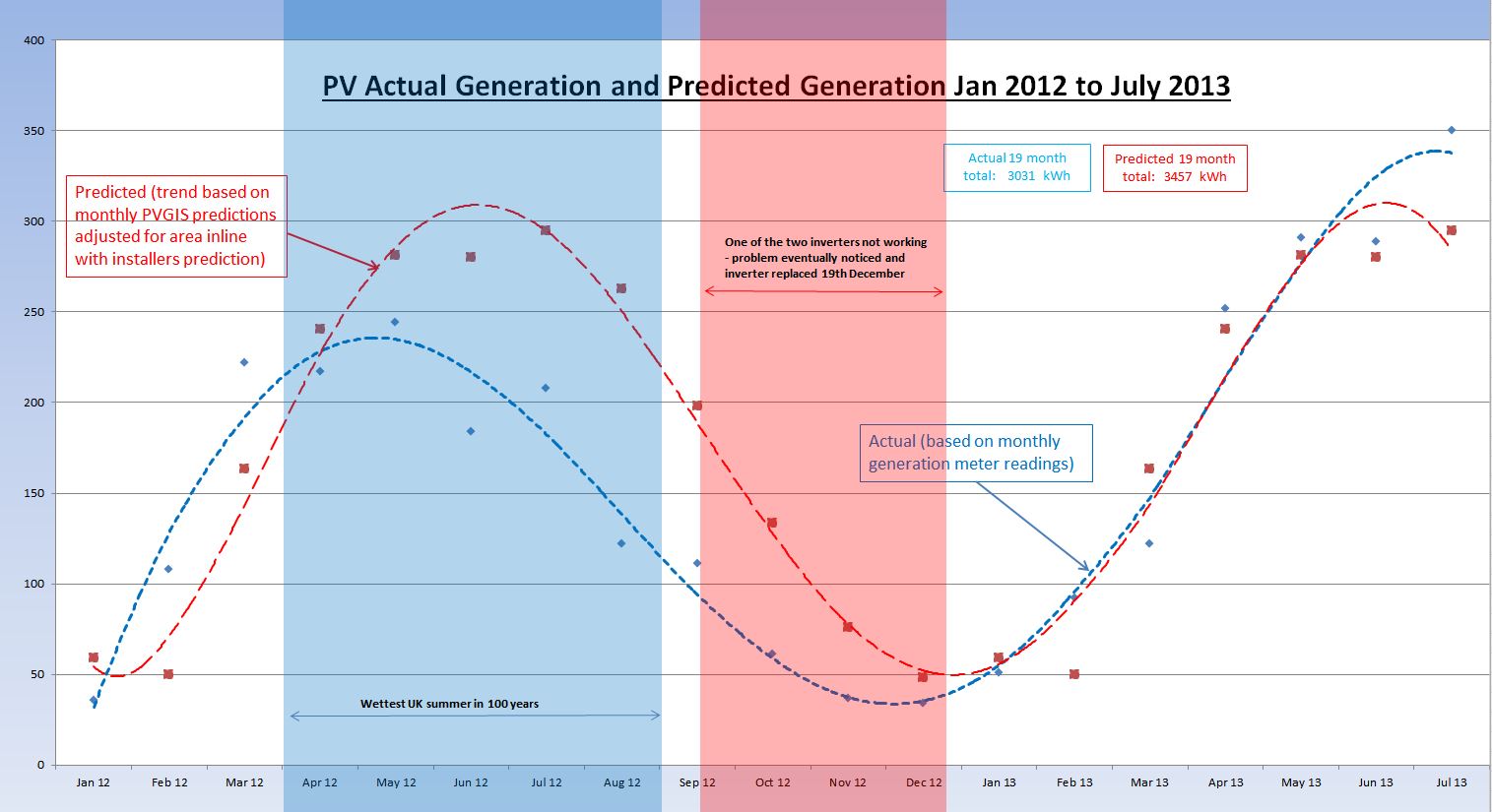 What does this tell us? Well as we know last year was rubbish – well ahead of predictions for February and March 2012, then they forecast a drought if I remember correctly and the rest of the year it rained and generation was down around 30%. So far this year we are well on target and even exceeding predictions by 50kWh for July giving us a chance to make up a bit of the approximate 500kWh we lost to weather and faulty inverter last year. So I reckon all is well with the PV set-up – let’s just hope the sun keeps giving 🙂